MC ESCHER PROJECT
Above is my submission for the MC Escher project which was assigned in class. The assignment required the use of perspective drawing. I started by drawing a picture of a room using perspective and then picked a particular building for use in my project. I chose to use perspective drawing to portray a ski lodge. I started by depicting a basic log sided building, and drew the characteristic ski lifts in the background. I used shading in this drawing as well to depict a source of light for the scene I wished to portray. It was also required of us to draw a fictional character within our drawing, for which I chose to draw a yeti terrorizing the scenery.
Connor Carr Art
Wednesday, May 29, 2013
Logo Project
Above is a photo of my Logo which was created for the Logo Project assignment. I first used various magazines and media sources to gain inspiration for creating my logo. I combined this inspiration with my personal interest in soccer to create the above logo. I created this using various methods of drawing and shading, also utilizing artistic combinations such as the use of initials. I first used my initials as the beginnings of my project. I wished to combine my interests in soccer with my initials to show create a personal appeal within my logo. I used the design of a soccer ball, the most essential element in soccer, along with the second most essential element, cleats, to create a logo which truly exemplifies my interests.
Landscape Painting
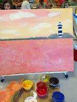
There are a lot of step I had to put into my painting. Composition for one was finding the painting that I thought would be the best for me to paint. I organized my painting by making sure there wasn't too much in one area and too little going on in another area. My atmospheric perspective was a little more difficult because it was a sunset and I had to mix the lighter colors and try to make them more dull. I created a light source with showing which way the shadows were going to make it look as if the sun was shining on the objects. I did and analogous color scheme with yellow, light orange, orange, and light green. For the most part my brush strokes went in an upward motion trying to make the thing grass look as real as possible. The way I used value in my painting was mixing the colors to make thing look as 3D as possible.

Tuesday, May 28, 2013
Pastel Still Life Project
Pastel Still Life
My compostition of my peeps was very planned to make it look as good as possible. I chose to do it this way to be able to show all the peeps at different angles, to see all of their sides. The viewfinder helped me by setting a small area to plan my ideas for my setups to help me come up with my final one. The viewfinder with my final setup looked the best so that is the one I chose. There were alot of techniques I used to make it look dimensional. I made it darker around the areas that had shadows of the other peeps on them. I drew out the sides of the peep to make it look 3D.
I created a light source by making things closer to it brighter and making the peeps cast shadows coming from it. The light source I chose was coming from the left side of the paper. So the shadows were being cast on the peep to the right of it.
Ceramics Project
The Ceramics Project
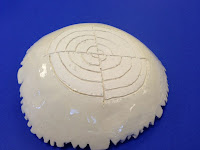
 The medium of my project was mainly clay, clear glaze, and brown slip to paint with. My bowl was medium sized maybe on the larger size compared to most normal bowls. The design element most stressed in this project was the radial designs. Which are designs that start from the middle and move outwards. There were two techniques you could choose from and they were the slump or the hump mold used to form your clay like a bowl. Personally I chose the hump mold meaning I put my slab of clay on top of an upside down bowl and the it fall and form itself. I learned alot from this project. The most importatnt thing I learned was how to make a radial design because it can be used in alot of different kinds of art. If I were to change the project I would allow myself to you different color glazes instead of just clear.
Subscribe to:
Posts (Atom)


